New Snow Queen Design
Inspired by “elegance, ice and individuality”, the new bottles are squarer and taller as well as heavier and rough in texture.
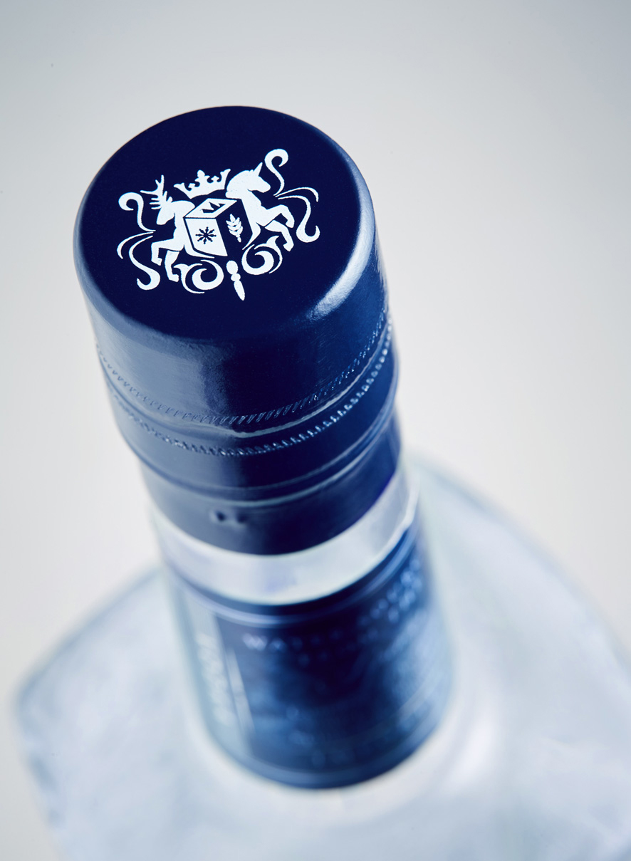
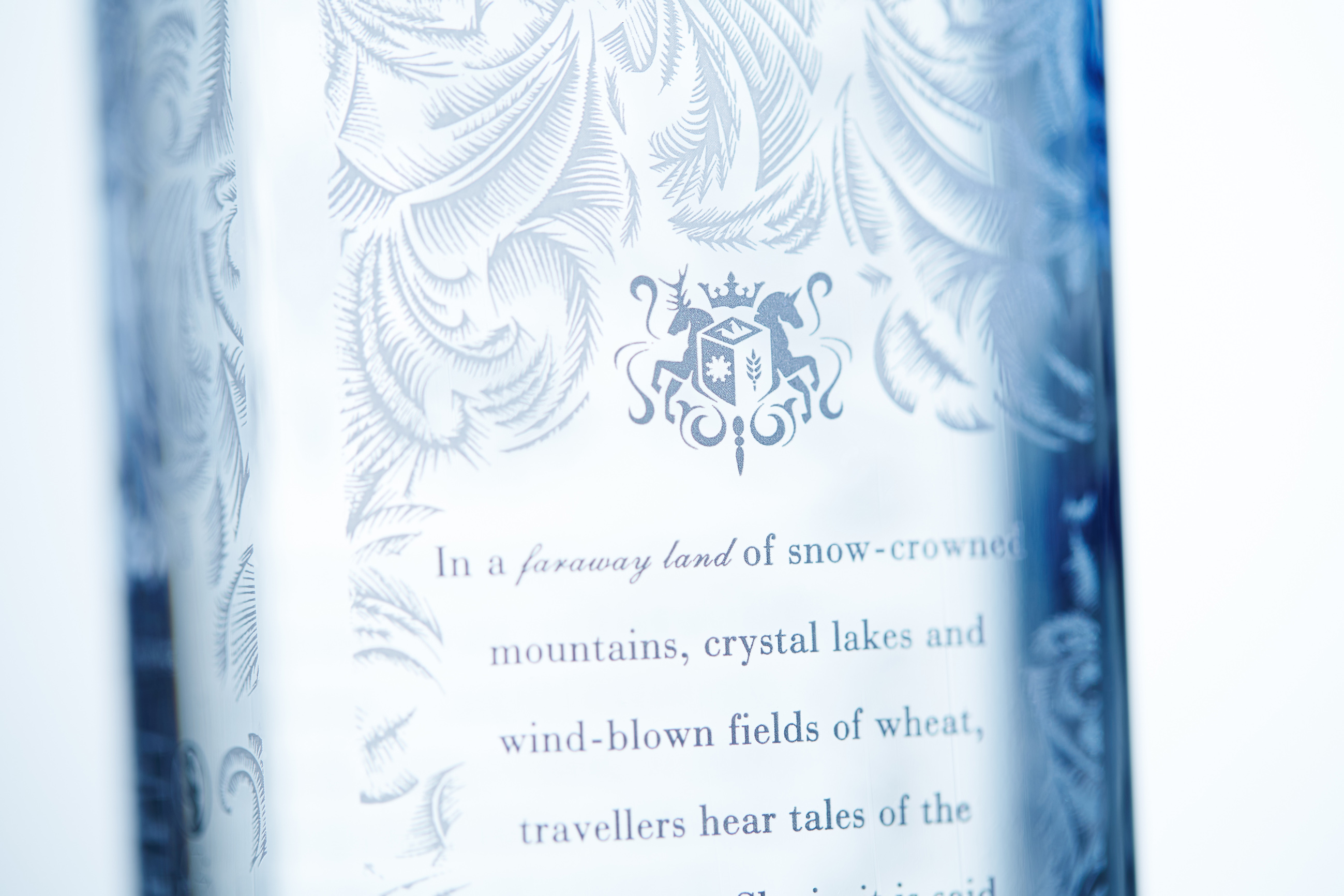
In addition, the design has darker colours with more blue, silver and white, with dark blue colours around the neck label to “bring consumer attention firmly onto the bottle”.
Targeted at the on- and off-trade, the bottle will be replacing Snow Queen’s round frosted bottle design.
In 2016, the brand moved its production site from Kazakhstan to Western Europe.
Roman Park, director of Ellustria, Snow Queen’s new brand management company, said: “To maintain its heritage of quality, Snow Queen has moved its production site to France. Its velvety smooth and light vodka is now based on EU-farmed organic wheat.
“When Roman Park, asked us to help him redevelop the Snow Queen brand we were thrilled. Together we came to the conclusion that it was necessary to build the whole story, immerse ourselves in the life of the queen, her realm and what she stood for. From there we started to visualise our ideas, translate the story into a brand, a bottle, a world and experience. We are proud of this truly unique story led design.” – Constantijn Huynen Managing Director Cartils.
The new design uses a hoar frost pattern as a unique magical ice cue, and the new crest to enforce the regal nature of the brand. The queen has been re-illustrated to have a better presence, while a square bottle was chosen to stand out and represent a block of ice. On the side of the bottle the story was added to give the brand a deeper emotional level. Illustrations of the realm were created as off-pack communicators to give this brand a unique and magical sense of provenance. All in all, this is a strong brand with an intriguing character, just asking for your attention to find out that little bit more.